As a final project for Michigan State University's UX 805 Quantitative Analysis & Insights course, I created two website prototypes with different menu designs and conducted
a usability test to determine which menu type enhanced user experience and improved efficiency. The website layout was modeled after Vogue.com's, as their menu structure was
unique compared to their top competitors, whom all shared nearly identical menu designs. This sparked my curiosity and made me wonder if Vogue's menu structure or their competitors
was more user friendly.
As stated above, this project aimed to evaluate two different navigation menu designs to assess which enhances user experience and improves efficiency on a website modeled after
Vogue.com. The two designs are:
Design A: A top navigation bar with categories and subcategories, emulating to Vogue's current top navigation structure
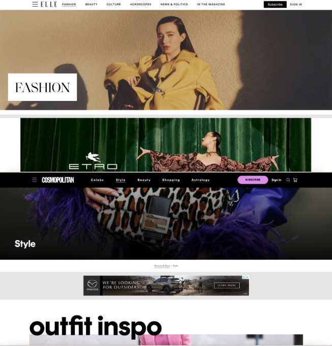
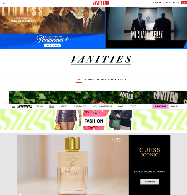
Design B: A sidebar menu with the same categories, but in a vertical layout. This design was chosen as it aligns with Vogue's competitors
(e.g. Elle, Seventeen and Cosmopolitan) who use sidebar menus without dropdowns.
Below are videos walking through each of the prototypes, with images of Vogue's competitors websites.
Methodology
Primary Research Question: Does the sidebar menu (Design B) improve user efficiency compared to Vogue's current top navigation structure (Design A)? How do users percieve
each design in terms of ease of use, satisfaction and visual appeal?
Prototypes: Two versions of the site were created in Figma
Testing Procedure: Within-Subjects Test Design. I chose this method due to the small sample size. I wanted to have a more reliable comparison, controlling for user-related variability.
I also wanted users to be able to compare the designs at the end of the test. Each paticipant completed a series of tasks using both menu designs (e.g. navigating to different sections and subpages).
They then answered post-task and post-study questions.
Data Collection: Collected both quantitative data (task times and completion rates) and qualitative data (user satisfaction, ease of use and preference).
Mitigating Potential Issues: Pariticpants were randomly assigned to start with either Design A or B. This helped to control the order effect by balancing
which design is seen first. Used an alternative name than Vogue to avoid any potential bias or existing knowledge of the site. Short breaks between the two tests were done to reduce fatigue, since some of the tasks were repetitive. Tasks were concise and focused, ensuring
participants did not feel overwhelmed by testing two designs in one session.
Key Findings
Design A (Top navigation): Simpler, cleaner look and more whitespace. However, the inability to preview subcategories before clicking was a significant
pain point, with some suggesting dropdowns as a better solution.
Design B (Sidebar Navigation): This design was faster for participants to navigate, particularly for users already familiar with sidebar menus.
However, users preferred the minimalism of Design A aesthetically. 5/6 participants reported feeling confident using both designs, while one user felt more confident using
the sidebar menu (Design B) over the top navigation (Design A).
Insights
Efficiency: While task completion rates and times were inconclusive due to some participants not being able to complete all tasks and order effect.
Questionnaire feedback suggested that Design B could offer more efficient navigation for familiar users.
User Preferences: Design A was preffered aesthetically, even when the participant thought Design B was more helpful in completing a task. Participants
expressed frustration with the inability to preview subcategories from the menu (preferring a dropdown structure).
Notable Results: One issue that was discovered in testing Design A (Vogue's menu design) was that the weddings page has a different subcategory layout than
every other page on the website. This led to 2/6 participants failing to find the correct destination and a significant increase in the other participants task time to complete this task compared to their time on other tasks.
The placement of ads on Vogue's site also contributed to this issue. The weddings menu is placed directly under the main menu, which is also where an ad banner is. This hides the submenu even more, as users become used to skipping over this area to avoid the ads.
Recommendations
Redesign: Based on participant feedback and test results, the new design featured a top navigation bar with a submenu that drops down on hover,
allowing users to preview subcategories. An "About Us" section will also be added to the main menu, based on participants comment on the menu organization.
Further testing: Additional usability testing with a larger group will be necessary to confirm the impact of these changes and assess efficiency more
reliably. Thinking from the perspective of Vogue, A heuristic evaluation of the full site would also be helpful for identifying other usability improvements.
Re-design based on user feedback. A dropdown menu that appears on hovering over the main categories. Designed to fit in with Vogue's current visual system, modeled after the look of the
Weddings category submenu.
Tools & Skills
I used a variety of tools and methods to complete this project:
Data Analysis
Excel (for quantifying usability test results)
Miro (affinity diagram)
User Experience
Usability testing
Post-study Questionnaire
Zoom (usability test & presenting)
Prototype Design
Figma
Conclusion & Reflections
This project was a valuable learning experience in quantitative analysis within UX research. I gained a deeper understanding of how to effectively collect and analyze numerical data, such as task completion and error rates, to assess user experience.
Interpreting these metrics allowed me to draw meaningful insights about user behavior and the efficiency of different menu structures. I learned how to translate raw data into actionable recommendations for design improvements, emphasizing the importance of objective, data-driven decision-making in UX. This experience
has sharpened my ability to use quantitative methods to inform design choices and improve user interfaces based on measurable user performance and satisfaction.