Left facing arrow

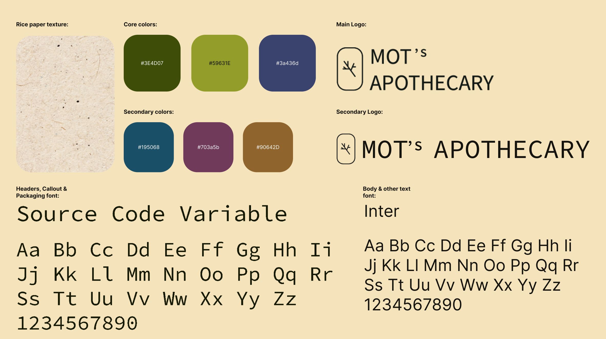
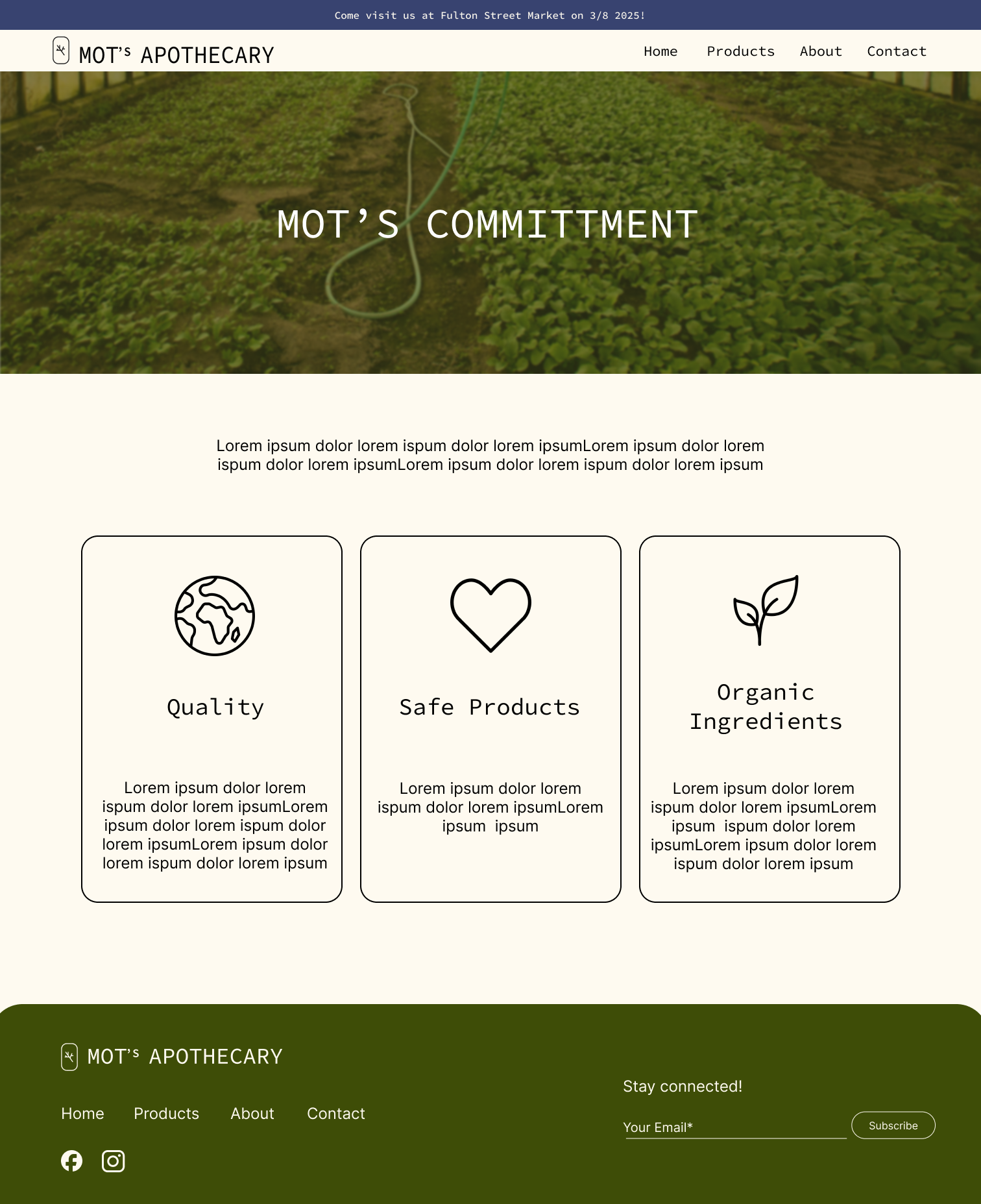
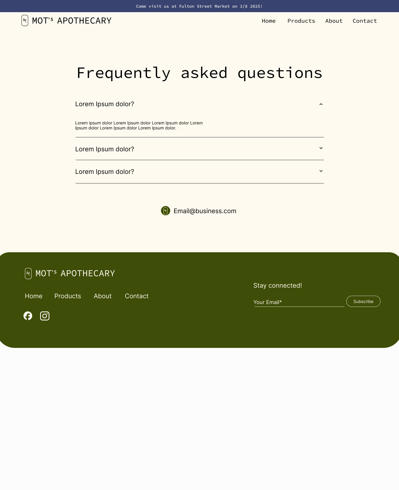
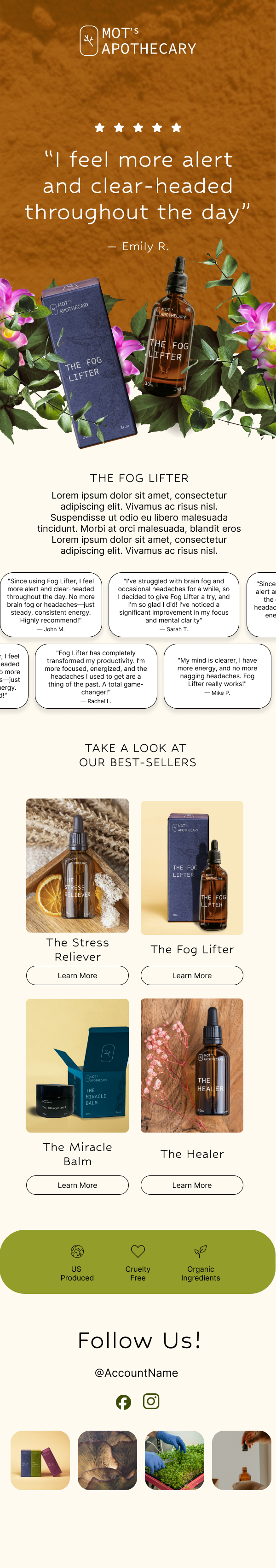
Brand Design for Mot's Apothecary

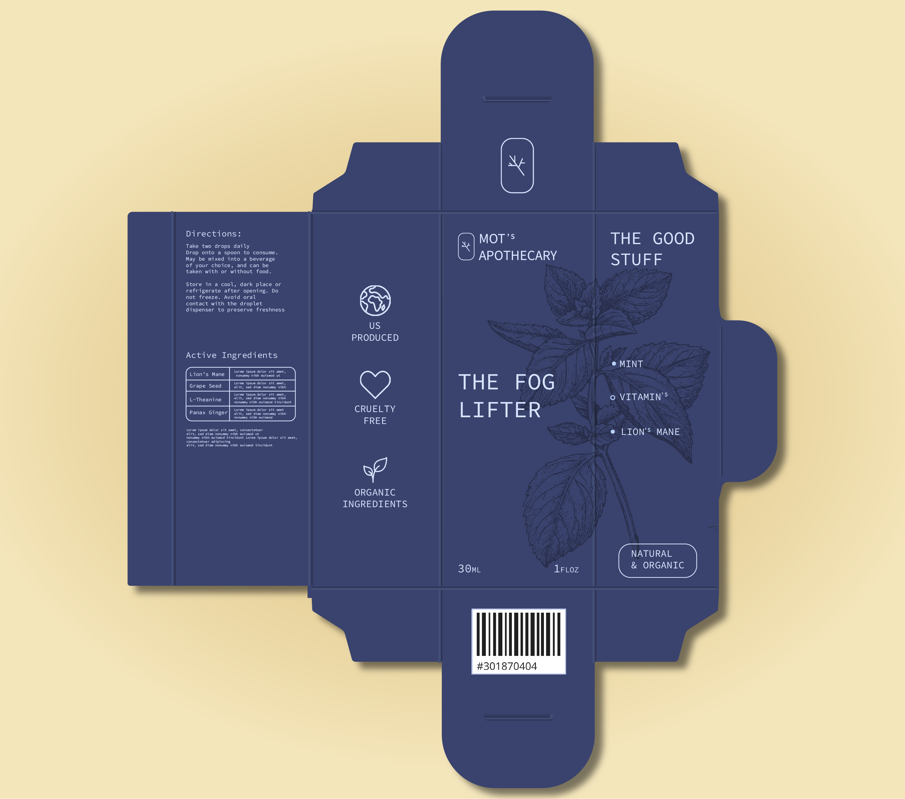
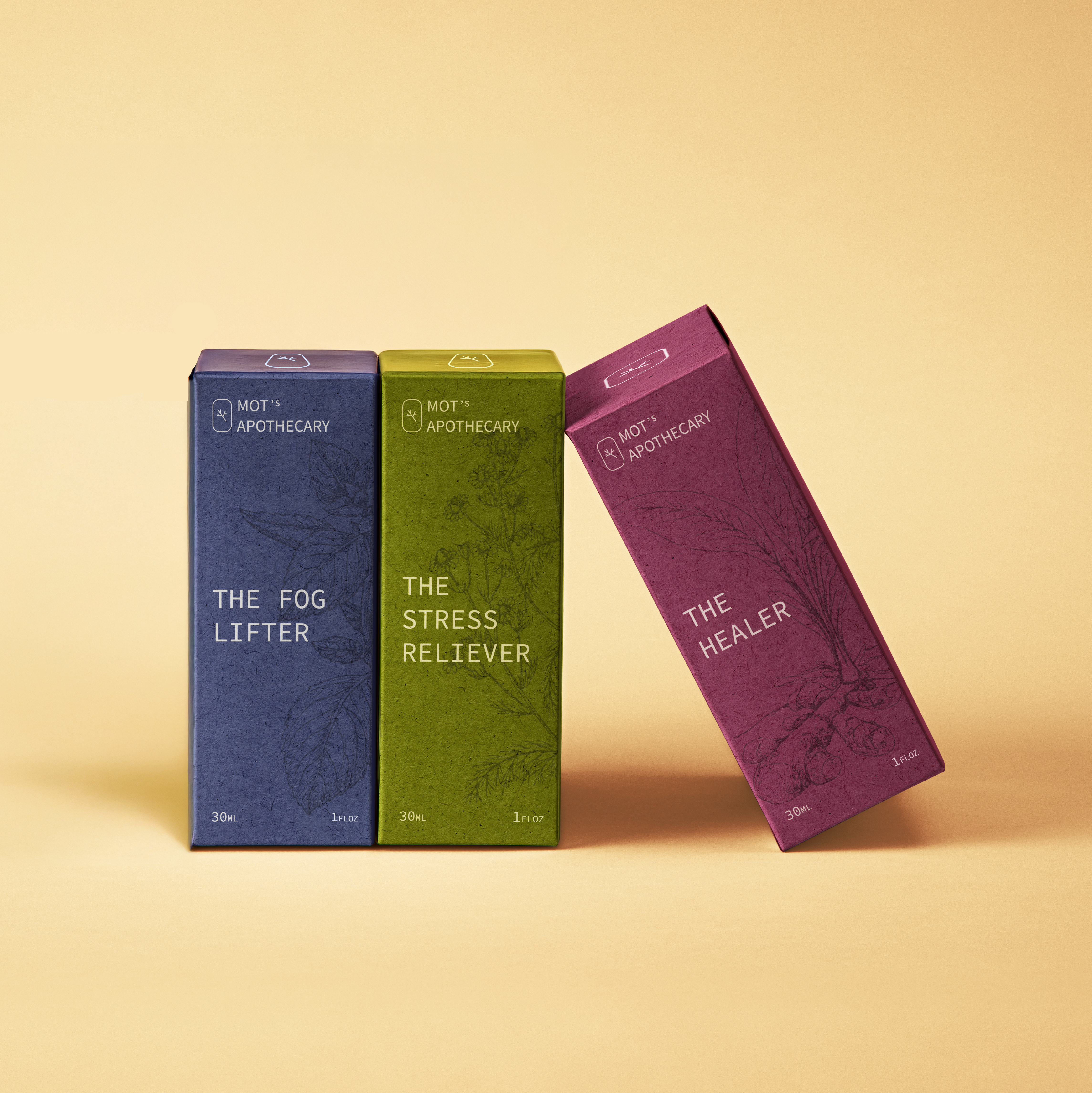
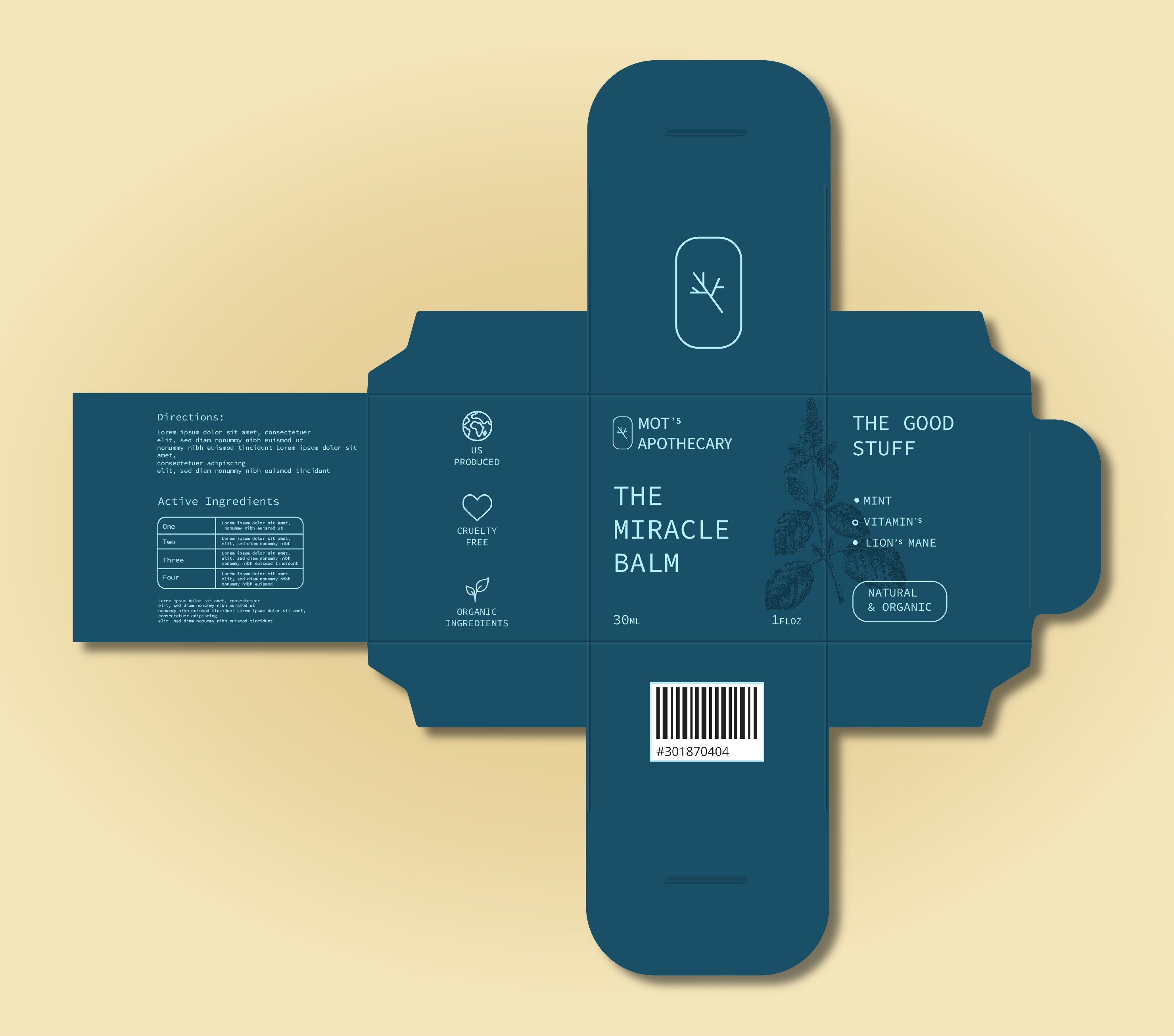
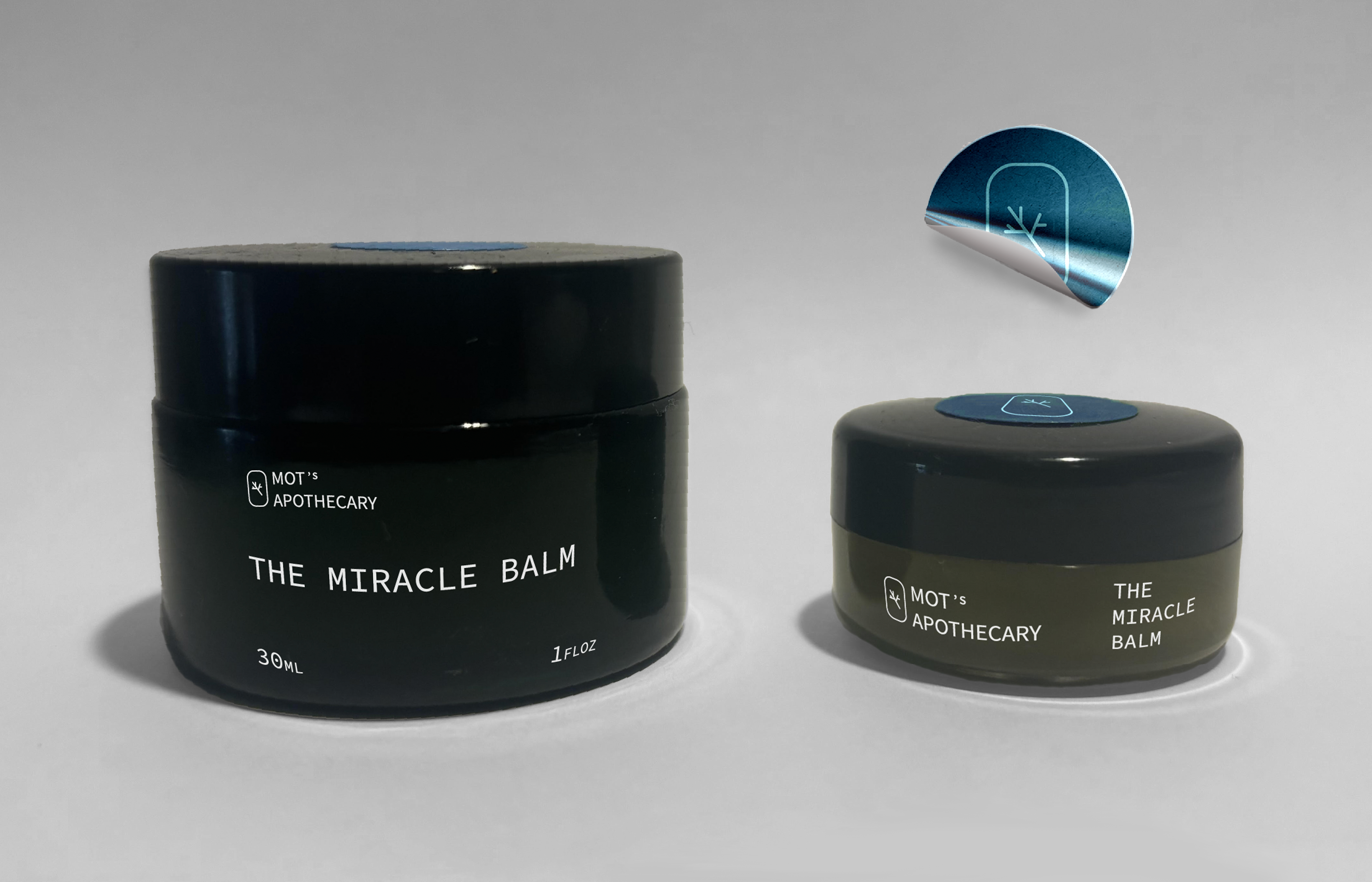
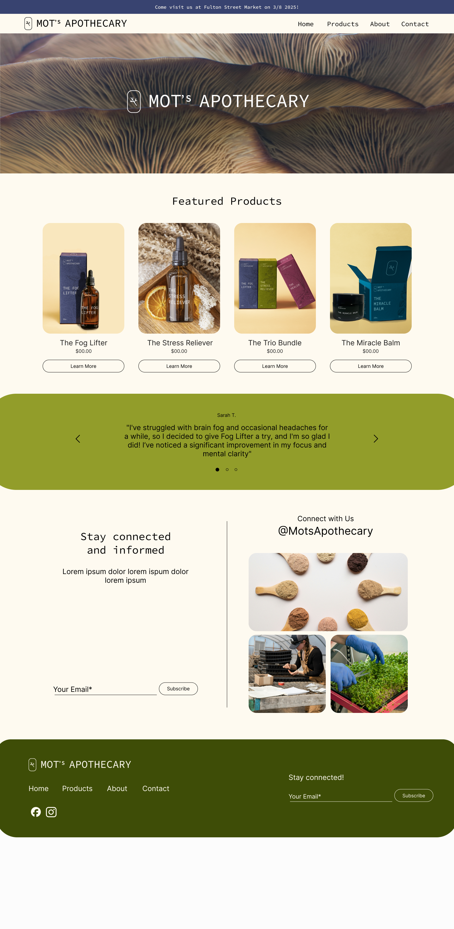
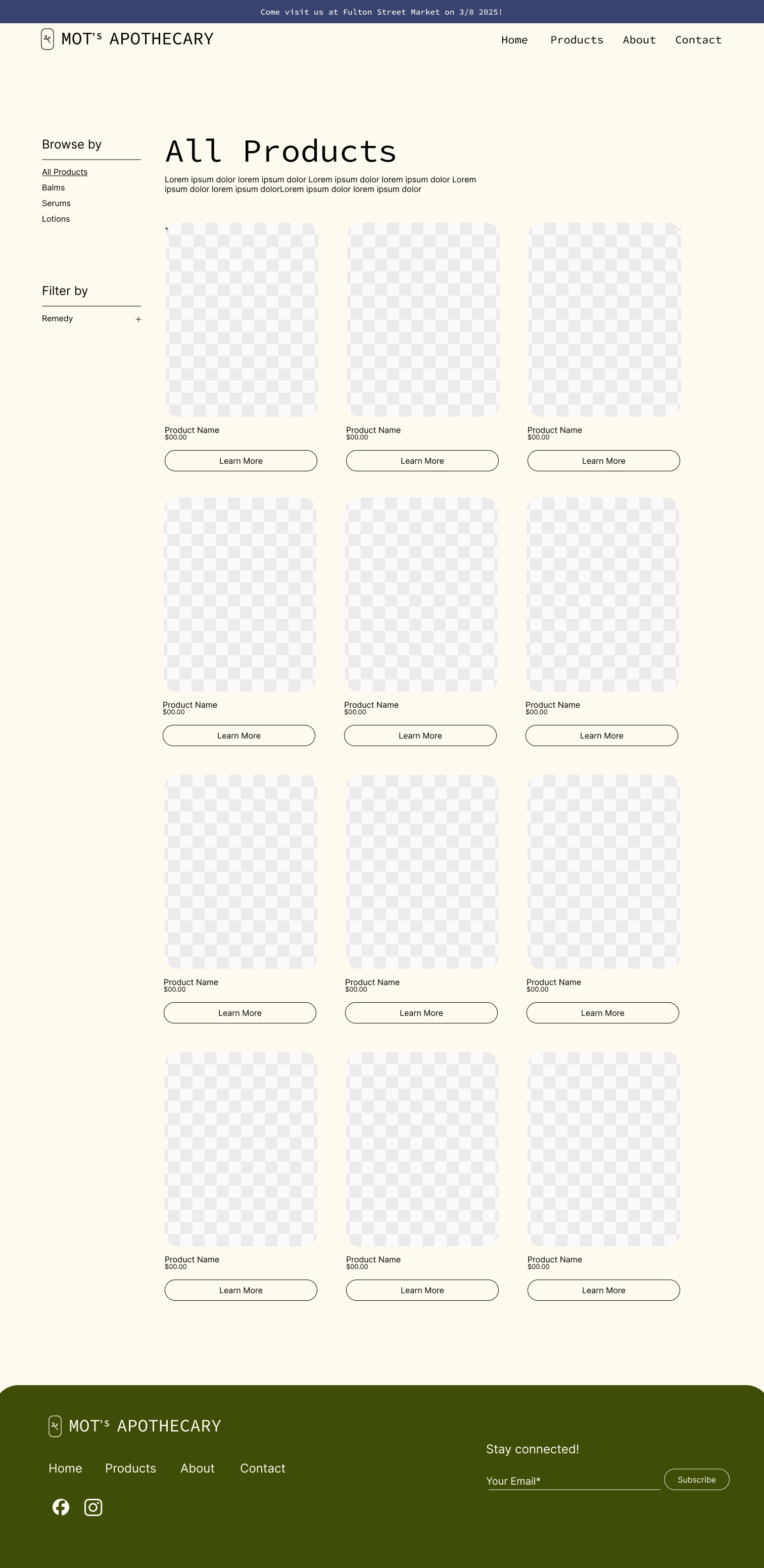
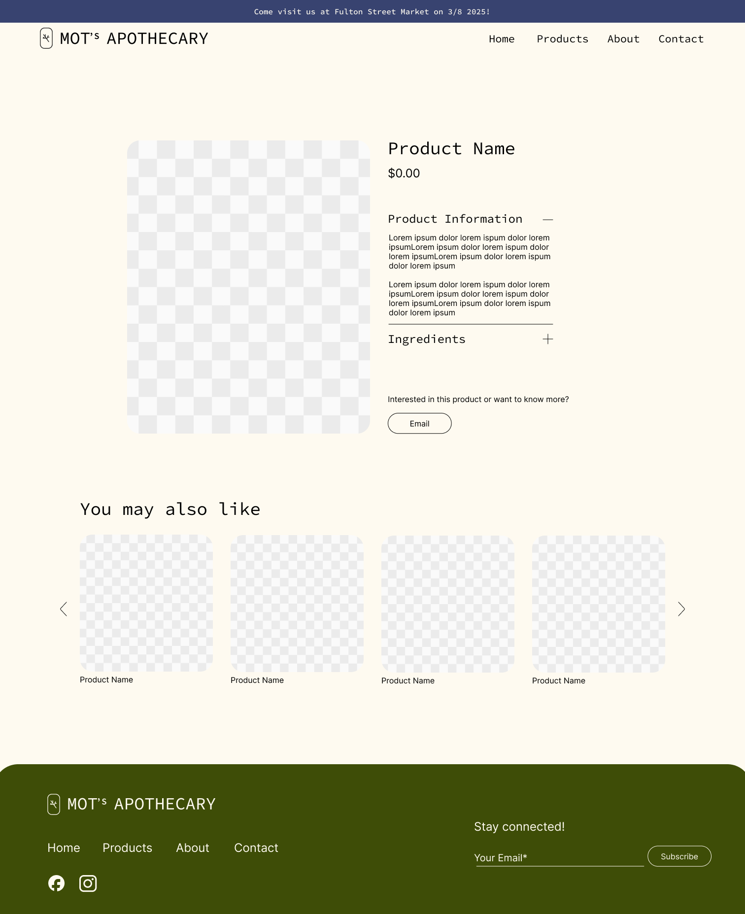
Mot’s Apothecary is a small business specializing in natural herbal remedies, including serums and balms targeting various health concerns such as headaches, immunity, and muscle soreness. When Mot's Apothecary approached me for branding, they had no existing logo or design system. The goal was to create a modern, earthy, and approachable brand identity that would differentiate the business from the typical green and white medicinal branding seen in the herbal remedy industry. The branding also needed to reflect the founder’s passion for healing, which he attributes to his faith.
As the sole designer for this project, I was responsible for creating the full brand identity, including: Logo Design, Website UI Design, Product Packaging Branding, and Promotional Materials. I worked closely with the founder to ensure the branding reflected his values and mission, while also considering the long-term growth of the business.

Timeline: 12/2024–1/2025 My role: Designer Team: Individual Project Industry: Health & Wellness
Packaging layout

Branding Concept & Challenges

Mot's Apothecary wanted a design that felt fresh and modern without losing the warmth of natural, holistic healing. The main challenge was how to stand out in a market saturated with typical herbal product branding, which often relies on muted greens or clinical whites. I wanted to create a brand that felt grounded, approachable, and clean, while emphasizing a connection to nature. The colors I chose reflect the colors of some of the key ingredients used in the products (example: green for mint leaves and pink for turmeric flowers). I also wanted to add texture to the packaging, I decided to use a rice paper texture as it contributed to the natural look and was fitting for the brand.

Logo Design

The logo is a tree branch, inspired by the Tree of Life, symbolizing healing, growth, and vitality—key themes for the business. The branch symbolizes the interconnectedness of nature and health, and having seven lines suggests a foundation in faith and growth. The logo uses organic themes to reflect the natural aspect of the brand, while still maintaining a modern, clean look.

Packaging Design

One of the key challenges was designing packaging that worked across multiple sizes of product containers, particularly for the smallest balm, which had limited space on the packaging. To address this, I designed the products boxes to have more visual content than the products themselves.
I incorporated illustrations of key herbal ingredients on the packaging to communicate the product’s natural origins. As said above, color schemes were chosen based on the colors of the plants used in the product, giving each product a distinct visual identity that relates directly to its herbal ingredients. The jars and bottles maintain a simple, clean aesthetic, with just the logo and product name featured on the front. For added differentiation, I designed a sticker for the jar lids that matched the color of the product packaging.

Unfolded bottle packaging
Mockup of Packaging
Unfolded jar packaging
jar branding on different sizes

Wireframe

Before starting the website design, I created wireframes to ensure a smooth user experience. The goal was to design a website that was easy to navigate, especially for customers who may not be familiar with the business, but want to learn more. I focused on simplifying the navigation and ensuring that essential sections like testimonials, FAQs, and product details were easily accessible.

Wireframe of Mot's Apothecary Website

Website Design & UI

Home page of designed website
Products page of designed website
Individual product page of designed website
About page of designed website
Contact page of designed website

Promotional Material

To help launch the brand, I also designed a set of email newsletters to connect with customers. These email designs reinforce the clean, earthy aesthetic of the brand while helping to increase engagment and outreach.

Welcome email design
Newsletter about a product email design

Tools & Skills

The skills and tools used to bring this project to life:

Design Tools

Adobe Illustrator

Photoshop

Figma

Web Design & Development

Figma (for wireframes, lo-fi and hi-fi prototypes)

Branding

Logo Design

Packaging Design

Email Design

Print Materials

Conclusion & Reflections

Mot's Apothecary now has a cohesive, modern brand identity that sets it apart from competitors in the herbal remedy space. The new logo, packaging, and website have helped the business establish a strong visual identity that reflects the founder’s values and the healing properties of the products. The website is designed to serve as both an informational hub and an online store as the business grows.
By focusing on natural, earthy tones and the symbolism, I was able to create a brand that feels modern, and inviting.
This project was a unique opportunity to help a small business create a brand from scratch, and I appreciated the opportunity to continue practicing my design skills. The challenge of differentiating Mot's Apothecary from its competitors while staying true to its natural roots was both rewarding and fulfilling. I'm excited to see the brand grow and evolve in the future.